- Red Hat Community
- :
- Get Started
- :
- Welcome
- :
- Re: RHLC Think Tank
- Subscribe to RSS Feed
- Mark Topic as New
- Mark Topic as Read
- Float this Topic for Current User
- Bookmark
- Subscribe
- Mute
- Printer Friendly Page
- Mark as New
- Bookmark
- Subscribe
- Mute
- Subscribe to RSS Feed
- Permalink
- Report Inappropriate Content
- 90.5K Views
RHLC Think Tank
Thank you for being a member of the Red Hat Learning Community! As we aim to continuously build this collaborative learning environment, we welcome community backed ideas such as feature requests, platform enhancements, program initiatives and general feedback!
To submit an idea, you can reply to this post and to support an already mentioned idea, reply to the idea or offer a kudo.
Valid Think Tank Contributions:
- Feature requests or ideas
- Platform enhancements
- Additional forum discussions
- New training courses or offerings
- General feedback
*Please refrain from contributing counter productive content and attempt to provide constructive criticism.
Thank you!
Deanna
Deanna
- Mark as New
- Bookmark
- Subscribe
- Mute
- Subscribe to RSS Feed
- Permalink
- Report Inappropriate Content
- 12.7K Views
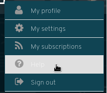
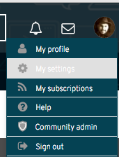
Hopefully it's not just my setup but the theme makes the profile menu entries hard to read when you mouse over them.
- Mark as New
- Bookmark
- Subscribe
- Mute
- Subscribe to RSS Feed
- Permalink
- Report Inappropriate Content
- 10.3K Views
It's not *that* bad on my side but it could be better.
- Mark as New
- Bookmark
- Subscribe
- Mute
- Subscribe to RSS Feed
- Permalink
- Report Inappropriate Content
- 8,433 Views
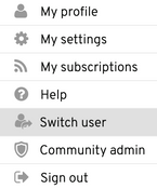
We have modified the menus to allow for a better user experience when navigating RHLC - thank you for the feedback!
Deanna
- Mark as New
- Bookmark
- Subscribe
- Mute
- Subscribe to RSS Feed
- Permalink
- Report Inappropriate Content
- 10K Views
Clicking on a badge, reveals the description for that badge. It seems that if a description doesn't exist then the badge disappears.
I tested this with Curious Contributor. Clicking on it reveals the description.
Clicking on Red Hatter, causes the badge to disappear.
- Mark as New
- Bookmark
- Subscribe
- Mute
- Subscribe to RSS Feed
- Permalink
- Report Inappropriate Content
- 10K Views
Thank you @ricardodacosta! Descriptions for all badges will be coming soon, in addition to a futher look at UI.
Deanna
- Mark as New
- Bookmark
- Subscribe
- Mute
- Subscribe to RSS Feed
- Permalink
- Report Inappropriate Content
- 10K Views
Deanna, I know more tweaking is coming, so please excuse any redundant suggestions. Concerning badges:
* badges appear in a couple of places, and the behavior I describe would not be the same for each, so I will be specific about the location
* on the user's profile, where badges are in a horizontal line - mouse rollover should display the badge name. Only the badge name, no description here. The user should not have to go to the full badge screen to see the labels for the badges they have. Most of the time, the number of badges they have will probably fit on that first line. Only when they are really interested in seeing all the possible badges would they go to the full screen.
* that last comment is important - that profile line of badges should display enough fundamental info that satisfies the user's basic need for information about them, so that they do not have to go to the full screen (which could be considered as a distraction from what we want then to do, which is go make and respond to postings.)
* on the full badge screen, though, where the badges are already titled, mouse rollover should display the description. Clicking on the badge should NOT be necessary. For me, it took me a minute to understand what the description was, because that was not what I expected to see by clicking on a badge. Not that I was expecting anything else, but I think interfaces have trained us that descriptions are always seen using mouseover text, not clicking through.
* Clicking through any object expects "drill-down" detail, not just a description. Drill-down for a badge could show (if this is even important to do - maybe not) things like how they got it, where they got it, how many others have it. Although, all that may be overkill or an unecessary distration also.
- Mark as New
- Bookmark
- Subscribe
- Mute
- Subscribe to RSS Feed
- Permalink
- Report Inappropriate Content
- 10K Views
Suggestion:
The wording "Ask a question" is accurate for somescenarios, but it seems odd for starting a non-question conversation or for posting something of interest to all. On first time posting, it made me wonder if I needed to look elsewhere for posting an informational article or starting a conversation.
Maybe the wording could include more? "Submit a query, start a discussion or post a tip..."
- Mark as New
- Bookmark
- Subscribe
- Mute
- Subscribe to RSS Feed
- Permalink
- Report Inappropriate Content
- 10K Views
I believe that that feature is going to be implemented when the full launch of the RHLC is done. At the moment there are some features which have been disabled my design.
@Deanna can confirm.
- Mark as New
- Bookmark
- Subscribe
- Mute
- Subscribe to RSS Feed
- Permalink
- Report Inappropriate Content
- 10K Views
Great suggestions @philip_sweany! We will have to explore this further and try to integrate additional verbage around the community.
Recommendation = Add additional wording other than "Ask a Question" to content contribution buttons throughout RHLC.
Suggestions include:
Submit a Query
Start a Discussion
Post a Tip
**Does anyone have additional suggestions here? @ricardodacosta @William
Deanna
- Mark as New
- Bookmark
- Subscribe
- Mute
- Subscribe to RSS Feed
- Permalink
- Report Inappropriate Content
- 10K Views
In addition to the above I'd like to see:
- Cheatsheet (for a nice short summaries of commands)
- How to (for more in depth guides on how to do something)
- Product News or News (for newsworthy items like when a new version of something is released and what's different)
Red Hat
Learning Community
A collaborative learning environment, enabling open source skill development.


